

You may have build several circular charts but a circular jitter plot creates a distinct and unique look.
Lets see how to achieve this.
Lets use our data source sample superstore. And create below calculations:-
- Index =Index()-1
- Random calculation will create random points = RANDOM()
- X=SIN(RADIANS([Index]))*[Random]
- Y= COS(RADIANS([Index]))*[Random]
We will now build our first worksheet:
- Change the Mark Type to Circle.
- Drag Category to Color.
- Drag Product Name to Detail.
- Drag Sales onto Size.
- Drag X onto Columns.
- Right-click on the object, go to Compute Using and Select Product Name.
- Drag Y onto Rows.
- Right-click on the object, go to Compute Using and Select Product Name.
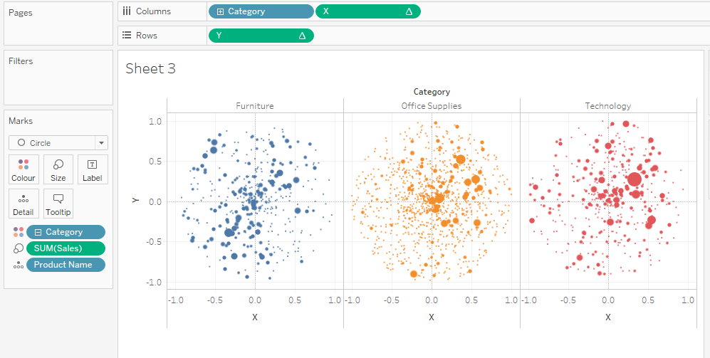
If all goes well, you should end up seeing below:

Your dashboard is ready now.
Now we can play around with this dashboard.
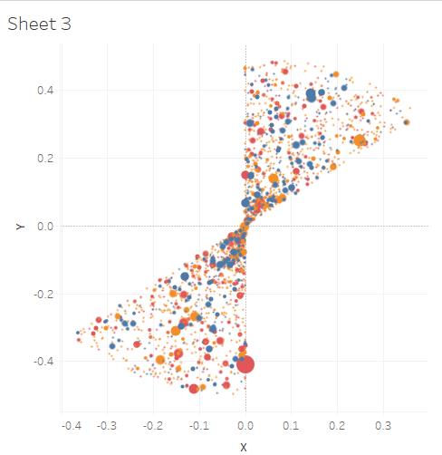
- Drag category or any other dimension to column and you’ll see something like below-
2. Lets change the Random() function to= RANDOM()+1 and you’ll get below-

3. Change the Index calcullation to= (INDEX()-1)%50 and you’ll like below-
This will come with the change in random() calculation
Lets change the random() calculation back to just RANDOM(). You’ll see below

4. Lets change Index() to= (INDEX()-1)%360 and Random()= RANDOM(). Drag Index to column and X to rows and change compute using Product name in both Index and X().
Finally you’ll see something like below-
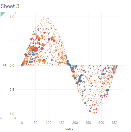
If you’ll drag Y onto rows , you’ll see something like this-

Hope it helps. Happy Learning!
